Color Psychology Interior Painting for Hartford-Area Homes: Warm vs Cool for Each Room
Colors do more than look pretty. They shape how rooms feel and how you use them. If you live in Farmington, West Hartford, Avon, or Simsbury, this guide explains how warm and cool hues influence mood, how lighting changes what you see, and how to read LRV so your home feels bright and balanced. For personalized help, explore our color consultations with Perkins Painting, LLC.
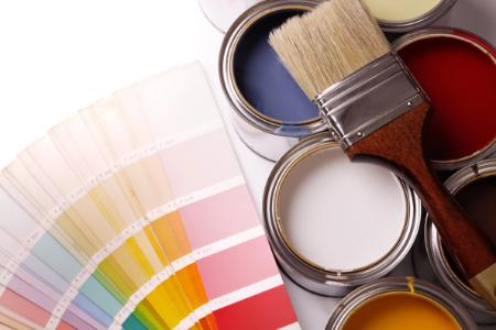
Curious where to start? Get a quick overview of color psychology interior painting and why the right palette can make a space calmer, cozier, or more focused without changing a single piece of furniture.
What Warm and Cool Colors Do in Real Life
Warm colors sit on the red, orange, and yellow side of the wheel. They tend to feel welcoming and energetic. Cool colors live in the blue, green, and violet family and often feel calm and spacious. In Central Connecticut, our long winters and cool daylight can make cool hues look chillier and warm hues feel extra cozy.
- Warm tones can make large living spaces feel more intimate and lively.
- Cool tones can make smaller rooms feel open and quieter.
Hartford County homes range from bright, south-facing colonials to shaded capes near mature trees. That variety matters. The same color will not look identical on a sunny Simsbury afternoon compared to a north-facing room in Unionville.
How Color Psychology Interior Painting Shapes Moods Room by Room
Living Room and Family Room
Gathering spaces work well with gentle warms like soft beige, clay, or muted terracotta to encourage conversation. If you prefer cool serenity, consider misty blue or sage that reads friendly rather than frosty. In open floor plans common around West Hartford, repeat a core neutral so the rooms connect, then add accents for interest.
Kitchen and Dining
Kitchens benefit from colors that make wood, stone, and metal feel coordinated. Warm whites and creamy neutrals flatter countertops and cabinets. Cooler greens and blue-grays can look crisp with brushed nickel and stainless. Choose a color that keeps the space feeling fresh during gray February mornings and bright July afternoons.
Bedrooms
Most bedrooms call for rest. Cool hues like dusty blue or soft green create a calm mood. Warm neutrals with subtle pink or peach undertones can feel soothing in north-facing rooms that struggle for sunlight. Avoid highly saturated brights that may feel stimulating when you are trying to sleep.
Home Office
Focus matters more here than anywhere. Mid-tone cools, like slate blue or gentle green, can reduce visual noise and help you concentrate. If the room gets little natural light, a warm greige can keep it from feeling flat during video calls. A single accent wall behind the desk can frame your background without stealing attention.
Bathrooms
Cool spa tones feel clean and fresh, but harsh lighting can push them too cold. Warm whites or sand tones soften tile and stone, especially under bright vanity lights. Keep strong contrasts limited so small baths still feel open.
Entryways and Hallways
These are your first and last impressions. A balanced neutral in a slightly higher LRV (more on that below) helps reflect light down corridors and ties adjoining rooms together. Use a deeper shade on a focal wall if you want definition without visual clutter.
Daylight vs Artificial Light: Why the Same Paint Looks Different
Connecticut’s light shifts across the year. Winter daylight leans cool, which can push blue or gray undertones forward. Summer sun is strong and can wash out delicate pastels. Inside, your bulbs change the story again.
- Soft white bulbs add warmth that flatters beiges, creams, and clay tones.
- Neutral white balances both warm and cool palettes for task-heavy rooms.
- Cool daylight bulbs emphasize blue and green undertones for a crisp, modern feel.
Watch your bulbs’ color temperature. Swapping lamps from warm to cool can shift wall color more than changing paint brands. If a hue looks dull at night, lighting is often the reason. Check colors morning and night in spaces where you spend the most time so the room performs well across your routine.
LRV Explained: Use Light Reflectance to Your Advantage
LRV stands for Light Reflectance Value. It runs from 0 to 100 and describes how much visible light a color reflects. Higher numbers bounce more light, while lower numbers absorb it and feel moodier.
Why it matters in Hartford County: many older homes have modest window sizes, tree shade, or a mix of north- and east-facing rooms. Use LRV to balance light. Brighter halls and entries often glow with mid-to-high LRV neutrals. Media rooms or cozy dens can handle lower LRVs without feeling cave-like when paired with warm lamps and lighter trim.
LRV is not about right or wrong. It is a tool to tailor brightness so spaces feel intentional on a snowy January morning and a humid August night.
Warm vs Cool By Room: Quick Wins For Hartford-Area Homes
Here is a simple way to think about fit, while still leaving room for your style and furnishings.
- Living areas: warm neutrals for welcoming energy; cool greens for calm balance.
- Kitchens: warm whites for comfort; blue-grays for a crisp, modern edge.
- Bedrooms: cool blues and greens for rest; warm greiges in low-light rooms.
- Home offices: mid-tone cools for focus; warm neutrals where daylight is limited.
- Halls and entries: higher LRV neutrals for bounce and flow.
If you want a hand translating these ideas to your own layout, our team can guide you through palette choices as part of our color consultations. We also coordinate placement and finishes with your interior painting plan so rooms connect naturally.
Daylight, Shade, And Neighborhood Context
Homes near West Hartford Center often have brighter, open layouts that can carry slightly cooler, modern palettes. Farmington and Avon neighborhoods with mature trees may lean warmer inside to counter shade from large canopies. Simsbury’s mix of capes and colonials often benefits from a unified trim color that ties rooms together while wall colors shift gently from space to space.
Test large samples in multiple spots is a smart mantra for the selection phase, but even more important is comparing how the color relates to fixed finishes like floors, counters, and tile. Undertone harmony beats trend chasing every time. For a deeper dive into balancing timeless and current looks, you can read this related article on color trends vs timeless choices.
Putting It All Together For A Cohesive Palette
Pick a hero neutral that threads through hallways and shared walls. Add two companions that share an undertone for adjacent rooms. Use one or two accents to define special areas, like a dining niche or built-in shelving. This approach keeps sightlines calm while giving each space its own personality.
Finishes matter too. Slightly higher sheen on trim sharpens edges and helps bounce light. Walls in a soft, washable sheen keep color honest without glare. Ceiling white should relate to your trim so undertones do not clash under bright kitchen lights.